But in GraphQL you can send the parameters like a query and get all the related content as well
GraphQL API flow
To use Graph QL you need to prepare schemas and based on the schema you can do filter the data.
For more information on GraphQL, you can be visiting the link
Benefits:
Avoiding iterative API requests as with REST,
Ensuring that delivery is limited to the specific requirements,
Allowing for bulk delivery of exactly what is needed for rendering as the response to a single API query.
How GraphQL can be used with Content Fragments?
GraphQL is a strongly typed API, which means that data must be clearly structured and organized by type.
The GraphQL specification provides a series of guidelines on how to create a robust API for interrogating data on a certain instance. To do this, a client needs to fetch the Schema, which contains all the types necessary for a query.
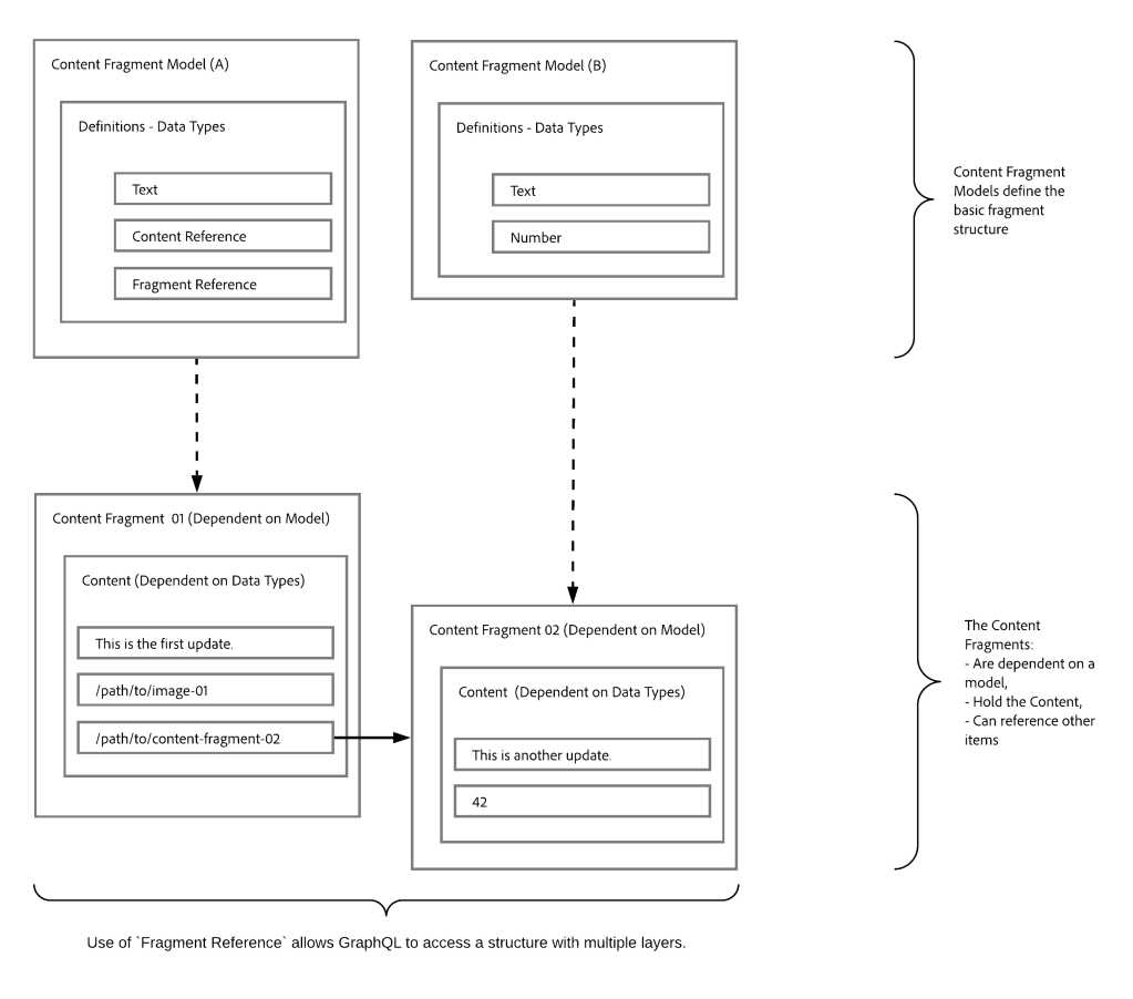
For Content Fragments, the GraphQL schemas (structure and types) are based on Enabled Content Fragment Models and their data types.
How Graph QL works on related content fragments?
Content Fragments can be used as a basis for GraphQL for AEM queries as:
They enable you to design, create, curate and publish page-independent content.
The Content Fragment Models provide the required structure by means of defined data types.
The Fragment Reference, available when defining a model, can be used to define additional layers of structure.
Model References provided by Adobe
Content Fragments
Contain structured content.
They are based on a Content Fragment Model, which predefines the structure for the resulting fragment.
Content Fragment Models
Are used to generate the Schemas, once Enabled.
Provide the data types and fields required for GraphQL. They ensure that your application only requests what is possible, and receives what is expected.
The data type Fragment References can be used in your model to reference another Content Fragment, and so introduce additional levels of structure.
Fragment References
Is of particular interest in conjunction with GraphQL.
Is a specific data type that can be used when defining a Content Fragment Model.
References another fragment, dependent on a specific Content Fragment Model.
Allows you to retrieve structured data.
When defined as a multifeed, multiple sub-fragments can be referenced (retrieved) by the prime fragment.
JSON Preview
To help with designing and developing your Content Fragment Models, you can preview JSON output.
Install:
AEM 6.5.11 (aem-service-pkg-6.5.11.zip)
Graph QL OAK Index (cfm-graphql-index-def-1.0.0.zip)
GraphiQL Developer tool (graphiql-0.0.6.zip)
For AEMacS you will get the content fragment with the latest update.
Go to configuration folder
AEM tools section
General selection in sidebar
Configuration bowser
As shown below:
Configuration Folder
Create a configuration folder and select
Content Fragment Models
GraphQL Persistent Queries
As shown below:
Create a Conf folder with required checkboxes
Go to Assets Model:
AEM tools section
Assets selection in sidebar
Content Fragments Model
As shown below:
Go to Assets CF
Select the folder and create the content fragments as shown below:
CF models
You can also install the package attached here
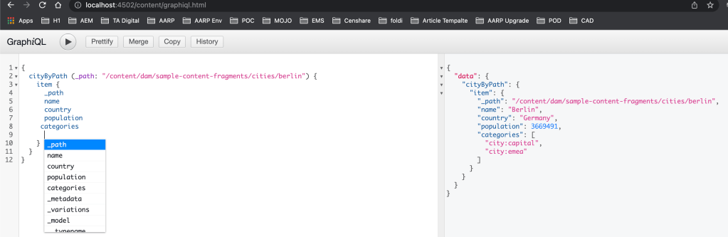
Go to the following URL to access the GraphiQL developer tool and run the following query:
Note: you can also get all the autosuggestions by using the ctrl+space shortcut
{
  cityByPath(_path: "/content/dam/sample-content-fragments/cities/berlin") {
    item {
      _path
      name
      country
      population
      categories
    }
  }
}
How can I get support for Core Image component within content fragment component?
Why should we use Core Image component?
Requirement:
Get support for OOTB image component within content fragment component
Introduction:
The Image Component features adaptive image selection and responsive behaviour with lazy loading for the page visitor as well as easy image placement.
The Image Component comes with robust responsive features ready right out of the box. At the page template level, the design dialog can be used to define the default widths of the image asset. The Image Component will then automatically load the correct width to display depending on the browser window’s size. As the window is resized, the Image Component dynamically loads the correct image size on the fly. There is no need for component developers to worry about defining custom media queries since the Image Component is already optimized to load your content.
In addition, the Image Component supports lazy loading to defer loading of the actual image asset until it is visible in the browser, increasing the responsiveness of your pages.
Create Custom Image content fragment component as shown below and add the following conditions into the element.html file:
Image Contentfragment Component
In the above HTL we are trying to tell if the element name contains the “image” (eg: primaryimage) keyword then don’t print it instead of that call an image model and get synthetic image resource
Note: Make sure your content fragment element name (field name) contains image word
Create a Sling mode ImageContentFragment Interface as shown below:
Create a Sling mode implementation ImageContentFragmentImpl class as shown below, this class is used to create a synthetic image resource for Adaptive Image Servlet to work:
Create an ImageDelegate Lombok based delegation class as shown below, for this example, I am using Image V3 component and this class is used to modify the image srcset method to add image path into the image URL:
Create a new Adaptive Image servlet and EnhancedRendition class, this servlet is used for displaying appropriate rendition of image component based on width selected based on browser width and pixel ratio:
Adaptive Image servlet is a modified version of the Core component Adaptive Image servlet because we are using synthetic image component and Enhanced Rendition class is a support class to get the best image rendition.
Create a simple content fragment Model as shown below:
Make sure the contentreference field name contains the image
Sample Content Fragment Model
Create a new content fragment under asset path (/content/dam/{project path}) as shown below:
Content Fragment
Create a sample page and add the content fragment component and select all the fields as a multifield as shown below:
Custom Content Fragment Component Authoing
As we can see we are able to fetch Core component Image component with Image widths configured into Image component policy (design dialog)
Content Fragment with OOTB Image
You can also get the actual working code from the below link:
How can I get support for the Core Accordion component within the content fragment component?
Why should we use the Core Accordion component?
Requirement:
Get support for OOTB Accordion component within content fragment component
Introduction:
The Core Component Accordion component allows for the creation of a collection of components, composed as panels, and arranged in an accordion on a page, similar to the Tabs Component, but allows for expanding and collapsing of the panels.
The accordion’s properties can be defined in the configure dialog.
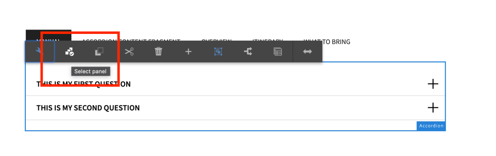
The order of the panels of the accordion can be defined in the configure dialog as well as the select panel popover.
Defaults for the Accordion Component when adding it to a page can be defined in the design dialog.
How to use Accordion for FAQ feature?
Manual authoring:
Drag and drop Accordion component, go to component dialog and click on add and select the component of your choice as shown below:
Accordion Dialog, insert panel
Once the component is selected add the question into the field
Author questions
Click on the panel selector icon and go to the individual item and make necessary changes
Panel SelectionAuthor answer
You can view it as published as shown below:
Published view of the Q&A
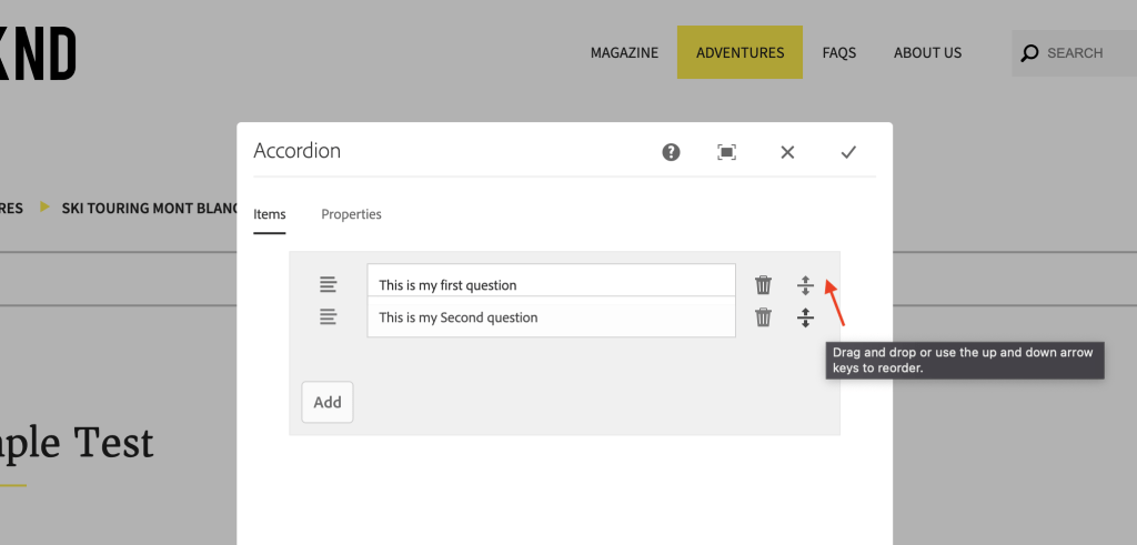
You can also rearrange the order of results from dialog
Dialog level reordering
Automated process:
Create a Sample model which can have a max of 10 Q&A’s as shown below:
Q&A content fragment
Create a custom Accordion component as shown below:
You can author the component by selecting the fragment path.
Notes: Please make sure we don’t author anything manually by clicking on add item
Author content fragment path
After authoring you can reload the page to see the content is being populated into the accordion model and all the changes made on the content fragment will be pulled into the component
Content fragment data is pulled automatically
You can also rearrange the order of the FAQ from dialog level or from the panel selector.
Rearrange from panel selector
Flexibility Vs Automation:
This component will automatically pull Q&A from content fragment but if there is any update on the question field then it won’t reflect hence please remove the field which is not pulling the latest results and refresh the page so that it pulls the latest.
Why are we seeing above issue?
We are unable to pull the updated questions into the component because this will remove the flexibility of rearranging the panels. Based on your requirement you can remove this functionality.
The article aims to explain the process of delegating OOTB components in AEM and customizing them by adding new parameters and methods.
Requirement:
This article is about delegating the Out Of The Box (OOTB) components of Adobe Experience Manager (AEM) using Lombok delegation. The author explains how to add new parameters and methods to the components using delegation. Specifically, the article covers how to delegate the OOTB image component, add custom logic to its existing methods, and introduce new methods such as getCredit() and getSizes().
Delegate OOTB image component and add custom logic on existing methods like getWidth(), getHeight(), and getSrcSet() and also add new methods getCredit() and getSizes()
Introduction:
Any field or no-argument method can be annotated with @Delegate to let Lombok generate delegate methods that forward the call to this field (or the result of invoking this method).
Lombok delegates all public methods of the field’s type (or method’s return type), as well as those of its supertypes except for all methods declared in java.lang.Object.
You can pass any number of classes into the @Delegate annotation’s types parameter. If you do that, then Lombok will delegate all public methods in those types (and their supertypes, except java.lang.Object) instead of looking at the field/method’s type.
All public non-Object methods that are part of the calculated type(s) are copied, whether or not you also wrote implementations for those methods. That would thus result in duplicate method errors. You can avoid these by using the @Delegate(excludes=SomeType.class) parameter to exclude all public methods in the excluded type(s), and their supertypes.
The below image shows how the Lombok delegation happens:
Lombok request delegation
Whenever we make a request to a class (for the Image Sling model) the Lombok delegation will copy all the public methods and exclude the methods which we want to override and provide the custom implementation to those methods.
Image Component Delegation
For our requirement, I am creating a class called ImageDelegate and implementing the Image component interface.
I will be making the call to the Image component using @self via ResourceSuperType and using @Delegate annotation I will be excluding some of the methods inside DelegationExclusion interface class
I will be adding custom code to the overridden methods and also I am able to introduce new methods getCredit(), getSizes()


 AEM best practices and development guide